Unifying Multiple Design Systems into One Scalable Platform
Theme: System Design, Strategy
Focus: Design System Creation, Enablement and Adoption

My Role: UX Manager
Team: 1 System Designer, 1 UI Developer, Engineering, PM
Responsibilities: Design Language Leadership, Stakeholder management, Strategy, Plan and Execution.
CONTEXT & CHALLENGE
Following acquisitions and parallel product development, the organization had multiple design systems in active use:
- Separate design kits across products
- Inconsistent components, patterns, and behaviors
- Divergent accessibility standards
- Duplicated effort across design and engineering
- Slower delivery and growing design & tech debt
- Confusion for customers moving between products
How might we unify our user experience without halting product delivery or alienating teams attached to existing systems.
PROBLEM
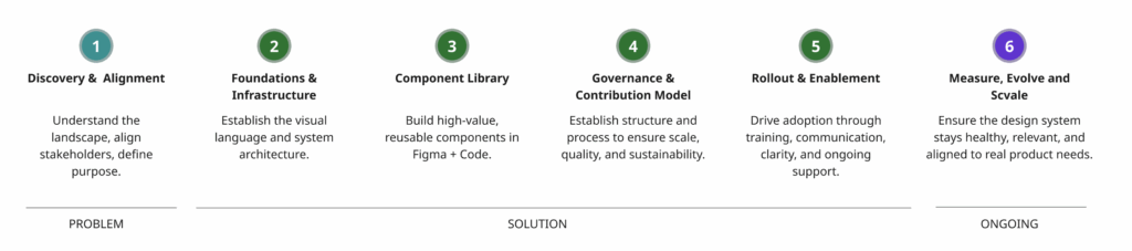
PHASE 1 – We did various discovery activities to understand the landscape, align stakeholders, define purpose and goals.
- Conducted a cross-system UI audit (components, patterns, tokens, behaviors)
- Mapped overlap, divergence, and gaps across systems
- Interviewed designers, engineers, PMs, and accessibility partners
- Reviewed code implementations and theming strategies
- Assessed adoption, trust, and pain points per system
- Define DS vision, principles, and north-star maturity goals
- Map dependencies (tech stacks, platforms, constraints)
Key findings:
- ~65–75% functional overlap across systems
- Different naming conventions for identical components
- Accessibility inconsistently implemented
- Some systems optimized for speed, others for brand or flexibility
- Teams feared loss of autonomy
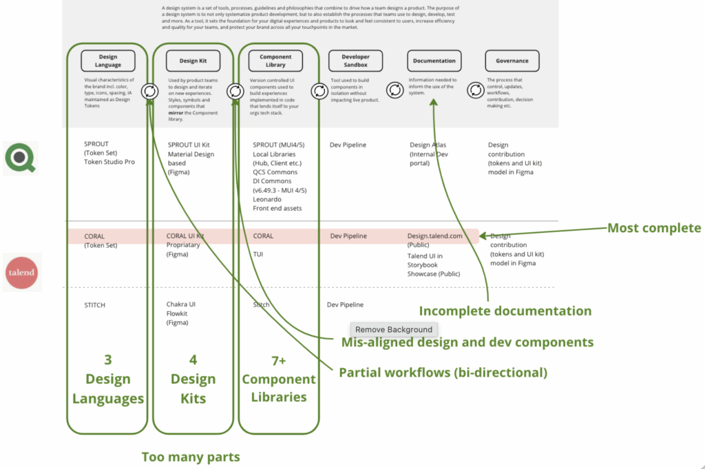
We aligned on a strategy: Unify Without Erasing
Instead of choosing a “winner” system, we defined a converged model: One system. Multiple entry points. Shared foundations. Including a set of core principles:
- Foundations first (tokens, accessibility, layout, motion)
- Progressive migration, not forced rewrites
- Contribution over control
- Design system as a product, not a library
We also aligned on a phased approach for the project.
SOLUTION
PHASE 2 – We established a visual language and system architecture.
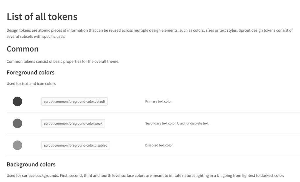
- Design tokens (color, spacing, type, shadow, motion)
- Grids, responsive rules, accessibility rules
- Figma Foundations Library
- Naming conventions and component architecture
- Technical infrastructure (Storybook, GitHub, token pipeline)
DELIVERABLES
Foundation tokens (Figma + Code)
Figma Foundations Library
Accessibility baseline (WCAG 2.2 AA rules)
SUCCESS SIGNALS
Designers using tokens
Eng + Design aligned on token architecture
No net-new CSS variables without tokens
PHASE 3 – Built high-value, reusable components in Figma + Code.
- Prioritize components based on frequency, complexity, and UX importance
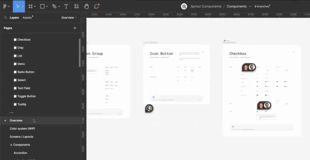
- Build UI components (buttons, forms, tables, cards, nav, modals)
- Define component states, variants, interactions
- Pair with engineering to build coded components
- Create usage guidelines → Do/Don’t → Accessibility rules
- Implement versioning and lifecycle model
DELIVERABLES
Figma Component Library (v1)
Storybook Component Library (code parity)
Component Documentation
SUCCESS SIGNALS
Designers using components in new feature work
Engineers building with coded library vs recreating
Reduced UI inconsistency across teams
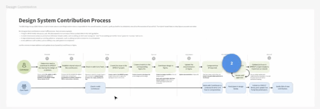
PHASE 4 – Establish structure and process to ensure scale, quality, and sustainability.
- Create DS governance committee (Design, Eng, Accessibility, PM
- Define component lifecycle:
Proposed → Experimental → Approved → Live → Deprecate - Set contribution workflow for team
- Set up versioning + release notesDefine QA checks (accessibility, responsiveness, security)
DELIVERABLES
Governance & Contribution ModelChange Request TemplatesAccessibility Review WorkflowDS Versioning + Release Process
SUCCESS SIGNALS
Component updates flow through a consistent process
Non-DS teams begin submitting contributions
Reduced “rogue component” creation
PHASE 5 – Drive adoption through training, communication, clarity, and ongoing support.
- Run rollout workshops (Design, Dev, PM, QA)
- Launch DS Atlas (ZeroHeight/Notion/Storybook site)
- Create onboarding kits for new hires
- Offer DS office hours + live support channels (Slack, MS Teams)
- Share component usage examples, templates, and code snippets
- Communicate release updates frequently
DELIVERABLES
Design System Atlas (docs, Figma, Storybook, guidelines)
Starter Kits (Figma templates, coded templates, tokens)
Training Playbook + Video Tutorials
SUCCESS SIGNALS
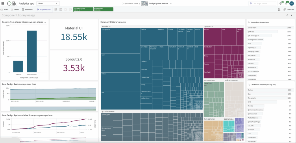
Adoption metrics → 60–80% of UI built from DS
Teams advocate for DS independently
Onboarding time sharply reduced
PHASE 6 – Ensure the design system stays healthy, relevant, and aligned to real product needs.
- Collect analytics: Figma usage, Storybook hits, component adoption
- Track system KPIs: velocity, consistency, accessibility, defects
- Regular audits for gaps, redundancy, or outdated components
- Add patterns (forms, navigation, tables, filtering, workflows)
- Expand to experience-level templates (flows, scaffolds)
Introduce automation or AI-based enhancements
DELIVERABLES
DS Health Scorecard
DS Maturity Model Roadmap
Quarterly DS Releases
Experience-Level Patterns (beyond components)
SUCCESS SIGNALS
DS is treated as a product, not a project
Organization-wide ownership & advocacy
Reduced design & dev duplication, fewer UX issues
IMPACT
- Improved consistency & brand coherence across products, reducing fragmentation and user confusion.
- Accelerated design and development velocity through shared components, tokens, and patterns.
- Lowered design and engineering debt, eliminating duplication and simplifying maintenance.
- Stronger accessibility and quality standards, enforced once and scaled everywhere.
- Better cross-team alignment and scalability, enabling teams to build faster while staying aligned to a shared vision.
LESSONS LEARNED
- Unification is as much about people as systems — alignment, trust, and clear communication matter more than tooling alone.
- Governance must be lightweight but explicit — without clear ownership and contribution models, fragmentation returns quickly.
- Not everything should be merged verbatim — successful consolidation requires intentional pruning, prioritization, and compromise.
- Adoption depends on enablement, not enforcement — training, documentation, and support drive long-term success.
- Measure impact early and often — adoption metrics, quality signals, and velocity gains are essential to sustaining buy-in.